


LESSON OVERVIEW
Ever found yourself captivated by an environment and wondered what made it so impactful? A big part of that magic lies in the power of color! Color is an incredible tool that impacts how people perceive works on a subconscious and emotional level, all while adding depth to storytelling. By understanding the psychological effects of color on a scene, we can weave subtle details into our environments to create the vibe we want viewers not only to see but also to feel.
WHAT IS COLOR THEORY?
Color theory is a system that helps us understand how certain colors interact and influence the emotions and perceptions of a viewer. Artists, designers, and creators use color theory to choose the right colors to shape the mood and message of their work.
COLOR MODELS

Before we get into the nitty gritty, it’s important to understand what Color Models are! You might be familiar with RGB and CYMK -- these are two color spectrums that have individual purposes, with RGB being used for digital media, such as your computer screen, and CMYK is used for physical media, for example with printers.
RGB (Red, Green, Blue) is an additive color model used in light-based mediums like screens and other digital displays. Colors are created by adding light, starting from black, and combining red, green, and blue to produce the full spectrum of visible colors.
CMYK (Cyan, Magenta, Yellow, Key/Black) is a subtractive color model used in print. Colors are created by subtracting light, starting from white (the color of paper), as inks or pigments absorb light to reveal the desired hues. Understanding CMYK is the key to ensuring that printed materials match their on-screen counterparts.
Every pixel on a screen is created using a combination of red, green, and blue, just like how every ink dot on a printed paper is a combination of cyan, magenta, yellow, and black.
RGB and CMYK are integral to color theory because they represent the two primary systems used to create and perceive colors in digital mediums, influencing how we work with and understand color.
THE COLOR WHEEL

The color wheel is a visual representation of colors arranged in a circular format. A "full" color wheel is a gradient containing the entire range of colors that can be used in an artwork, however, to make it easier to distinguish and understand colors, the wheel is often helpfully simplified into a selection of 12 colors:

The color wheel includes primary colors (like Red, Green, and Blue), secondary colors formed by mixing two primary colors, and tertiary colors created by mixing primary and secondary colors together.
COLORS AND EMOTIONS

Colors have a powerful effect on our emotions, and we see this in the real world with the way brands and restaurants use color to influence how we feel about them. For example, Subway uses green and earthy tones to convey an image of being "healthy" and "natural", McDonalds hints at its fast-food roots by relying on bold reds and intense yellows to grab attention and evoke a sense of excitement and urgency.
We can apply these same techniques to influence how people feel about the art we create.
⚠️
️It’s important to recognize that colors carry not just one, but a range of emotional associations. Even slight variations, like tints, shades, or even a color’s context within a story, can shift the mood or perception of the scene.


TEMPERATURE

We can further break down the color wheel into different temperatures: warm and cool colors.
- Warm Colors such as red, orange, yellow, and pink are typically used to express energy, excitement, danger, passion, and other high-intensity emotions.
- Cool Colors such as blue, green, and purple often are geared towards conveying calmness, mystery, melancholy, and other "reserved" emotions.


When well implemented, the juxtaposition of warm and cool colors can create a sense of transition, tension, or unease.
👉 Remember, there is a lot of nuance at play! For example, depending on the hue and shade, green can convey jealousy or trust, and red can convey danger or love. Context is key! More on hue and shade later 😉
COLOR COMBINATIONS
We have a sense of how colors affect emotions and perceptions of art, but now it's time to dive into understanding the terminology behind color combinations! Let's start with the most commonly used ones.
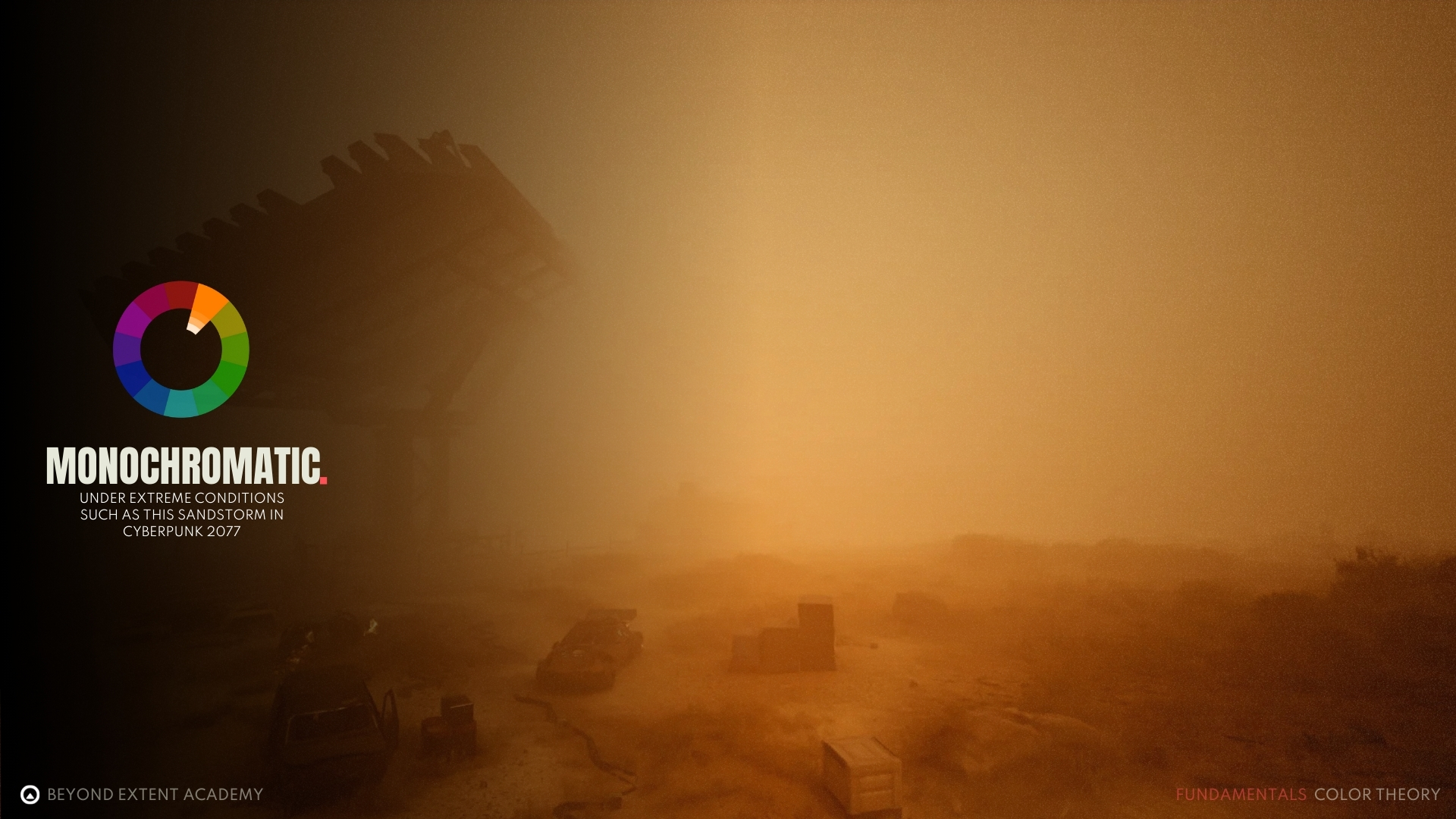
Monochromatic

A monochromatic scheme uses shades, tones, and tints of a singular base color. Monochromatic schemes are often used to create cohesion and visual balance.


Analogous

Analogous colors are colors that sit next to each other on the color wheel. They typically share similar hues. These color combinations are often used to create serene, or eerie designs because they naturally blend well together, offering a smooth transition between shades.


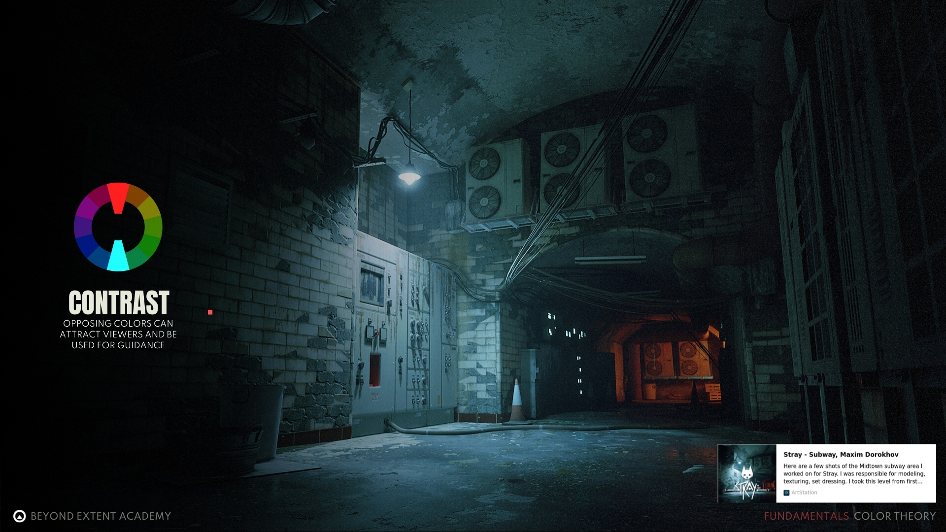
Complementary

Complementary colors are opposite each other on the color wheel. This high-contrast combo makes colors appear brighter and more striking when used together.


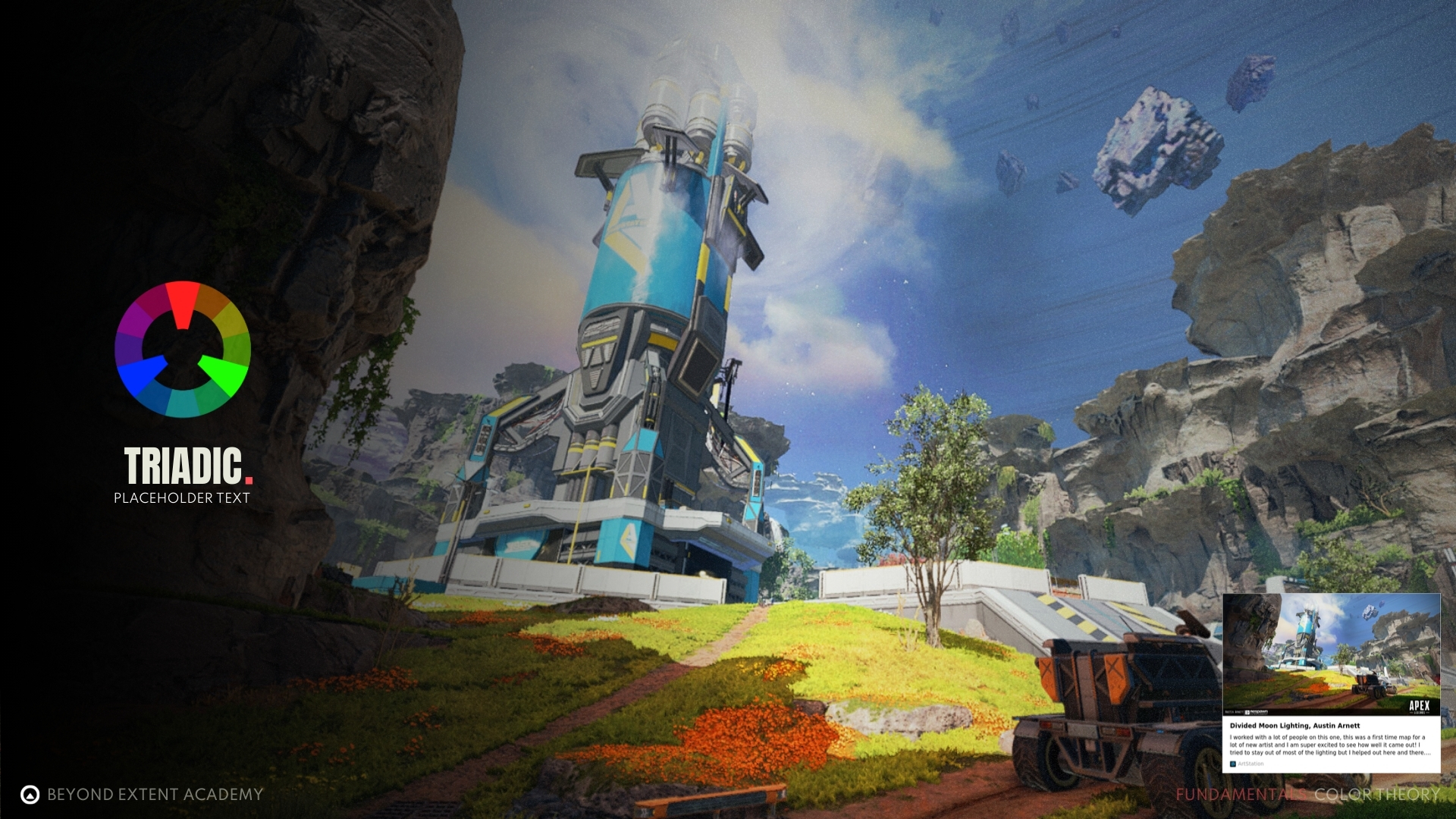
Triadic

A triadic color scheme uses three colors that are evenly spaced on the color wheel. It offers a high-contrast palette, but is more balanced and versatile than complementary colors. This combination creates bold, vibrant color schemes.


Additional color schemes
At this point you can hopefully tell that with increasing colors comes increasing potential for the scene to feel messy and unfocused. So even if you can still add additional colors into the mix it’s not advised to do so just for the sake of complexity and readability for the players. Plus you will rarely find good examples of this color pattern being used in games.
COLOR PROPERTIES

HUE
A HUE is the pure form of a color, such as red, blue, or green. It is a key component of color models like HSL (Hue Saturation Lightness) and HSV (Hue Saturation Value). Hue represents the basic identity of a color, independent of its brightness (lightness) or intensity (saturation), and is central to how we perceive and categorize colors within the visual spectrum.
SATURATION
SATURATION is a measure of a color's intensity or purity, indicating how vivid or muted it appears to be. Highly saturated colors are rich and vibrant, while low saturation color appear washed out. Saturation is expressed as a percentage, with 100% being the most vivid and 0% being a completely neutral gray.
LUMINANCE
Whereas Luminance refers to a color's brightness or lightness, indicating how much light it emits or reflects. It is expressed as a percentage, with 0% being pure black and 100% being pure white.

SHADE
Shades are variations of a color created by adding black, making the color darker without changing its hue. This deepens the intensity and richness of the original color, resulting in a range of darker tones. Shades are often used to add depth and contrast in art and design, creating a more dramatic and moody effect compared to lighter variations, like tints.
TINT
A tint is a variation of a color made by adding white, lightening the color without altering its hue. This softens the original color, creating lighter tones that retain the same base, conveying a softer, more delicate, or airy feel in art, design, and visual compositions, contrasting with darker shades for balance and emphasis.
TONE
A tone is a variation of a color created by adding gray (a mix of black and white), softening a color's intensity while keeping its hue intact. This results in a muted, subtle version of the original color. Tones are widely used in art and design to add depth, complexity, and balance to compositions, offering a middle ground between vibrant tints and deep shades.
exercise
Distilling an Image

Distilling an Image
overview
Look at your favourite move/game and try to use color theory to get what emotion they we’re trying to convey.
lesson example content
Get into it instantly by downloading the starter content for this lesson
download lesson contentexercise
Playing around with colors
Playing around with colors
overview
Take your favourite FAB Marketplace assetpack and light it with a couple of lights in Unreal Engine, and use the colors to convey an emotion
lesson example content
Get into it instantly by downloading the starter content for this lesson
download lesson contentexercise
Focus on a dedicated emotion
Focus on a dedicated emotion
overview
Pick one emotion to convey and convey it with a scene you downloaded from FAB
lesson example content
Get into it instantly by downloading the starter content for this lesson
download lesson content